Wharton Microsite
Yes. Even Wharton needs to convince people that Philly is “cool”
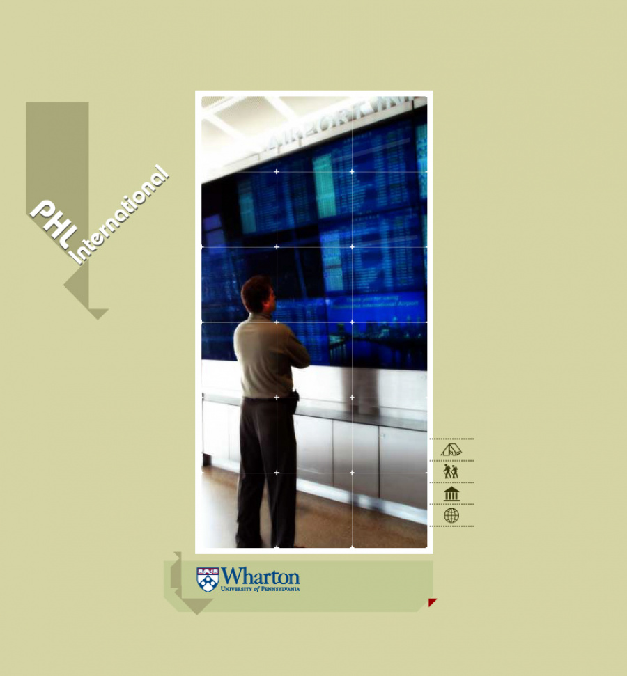
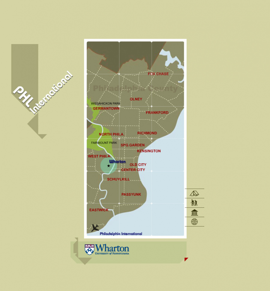
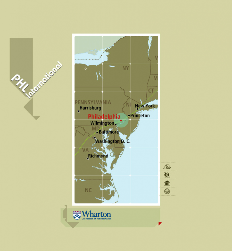
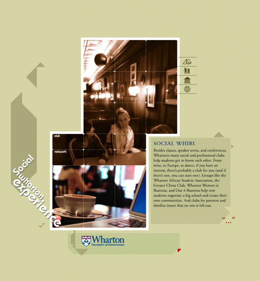
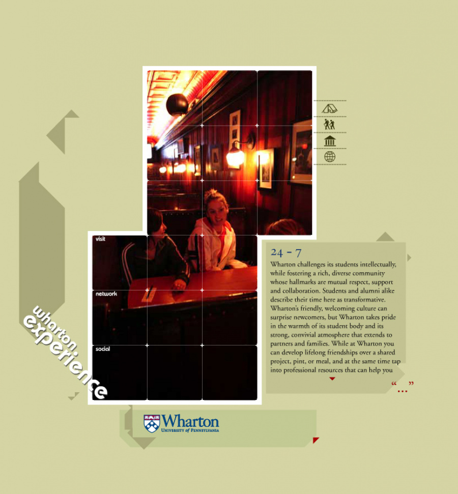
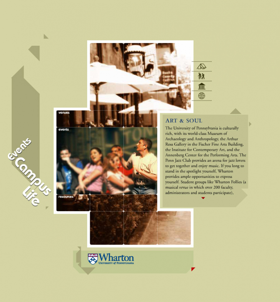
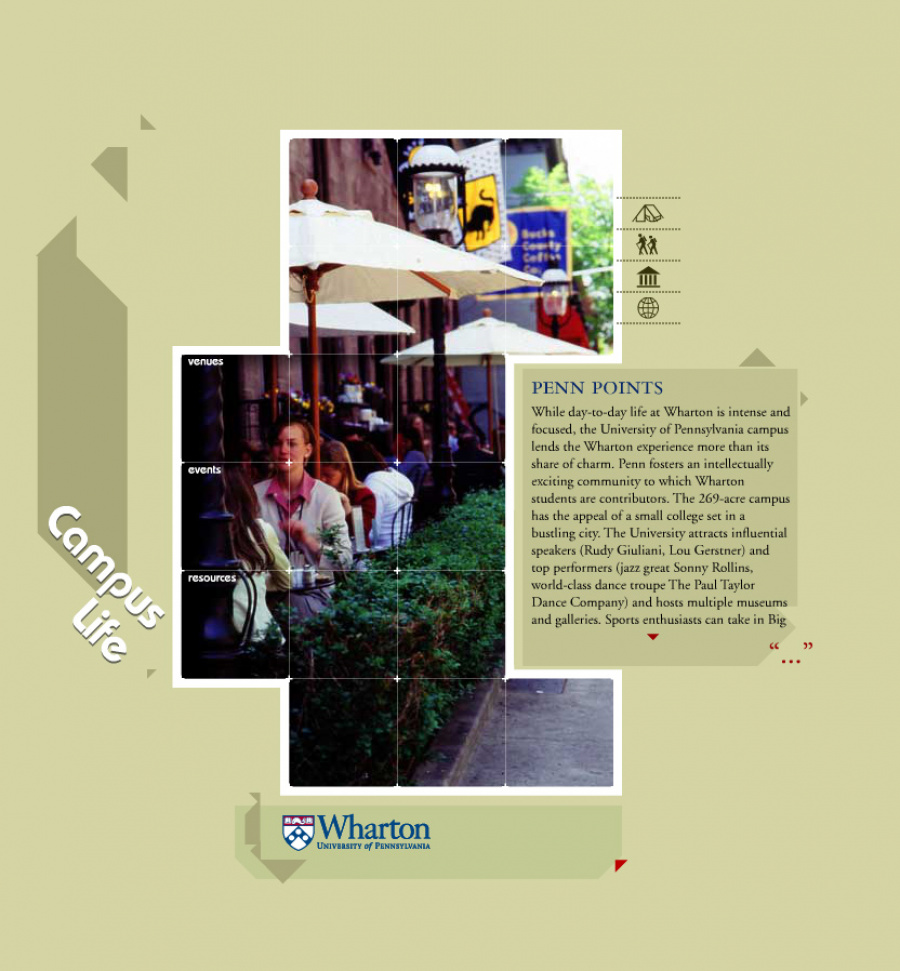
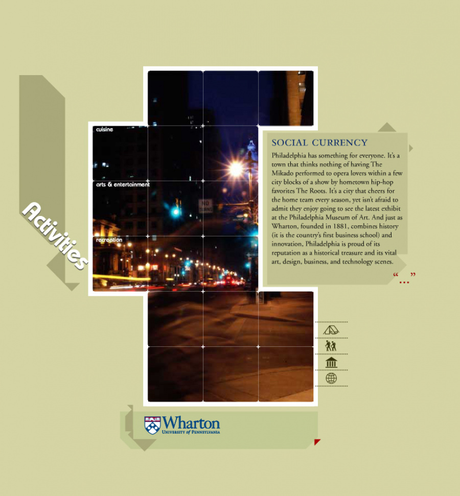
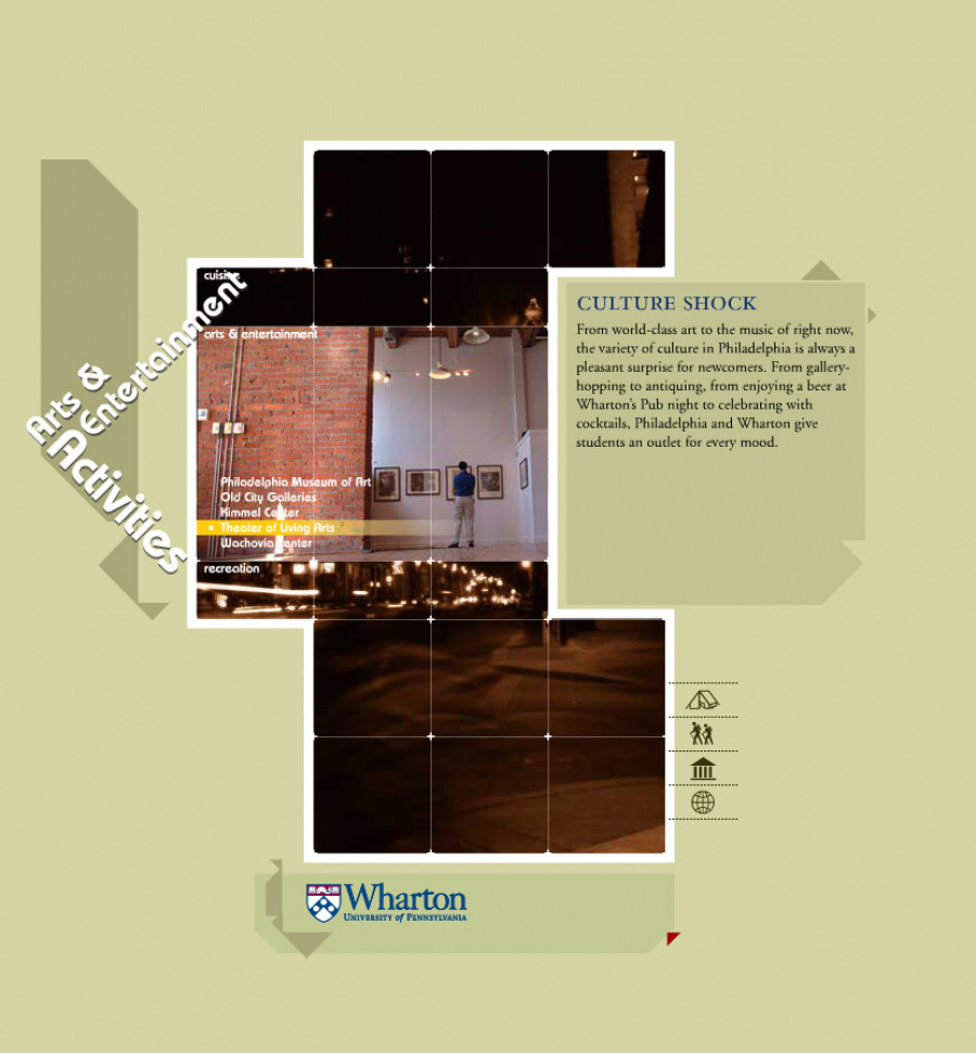
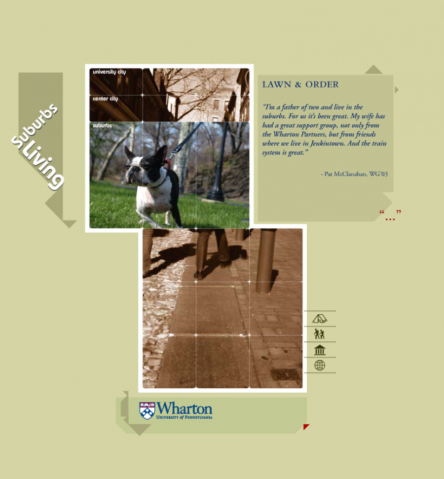
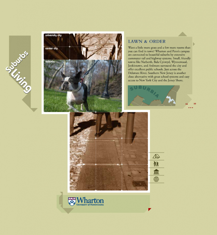
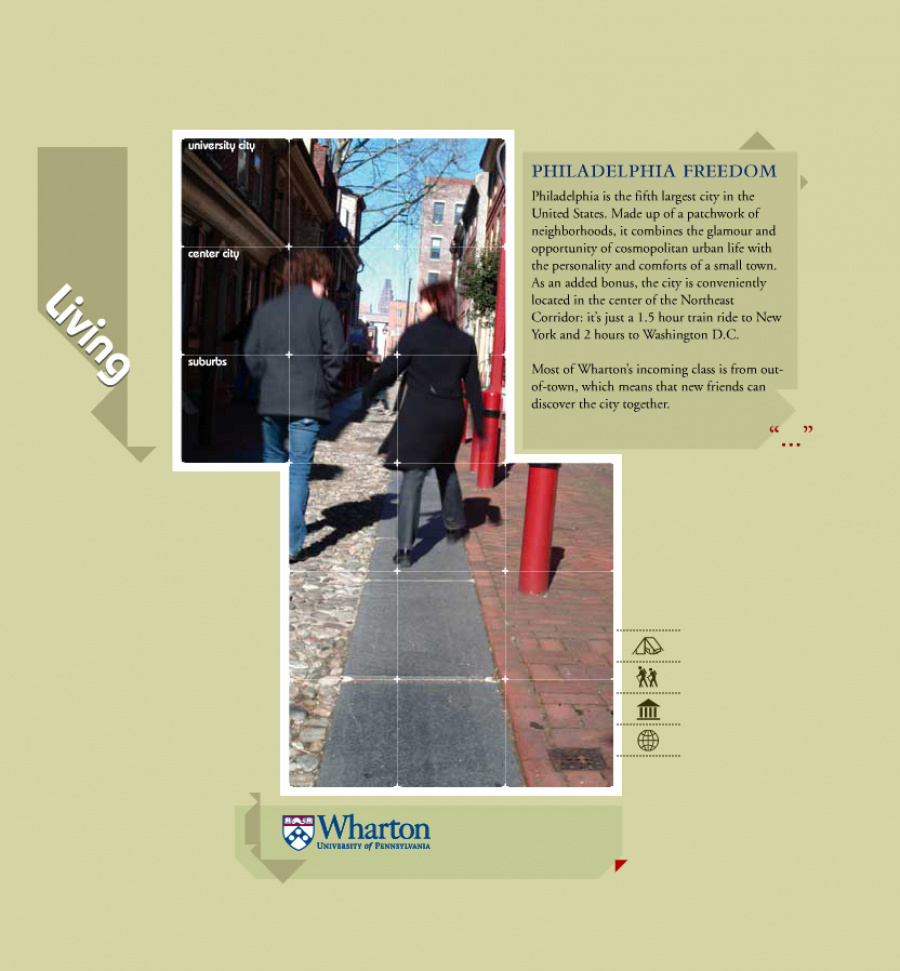
There was a time, not too long ago before hipsters could spread their “blessings” on something via the internet, when schools had to work a little bit harder to convince hopeful applicants, that not only is their program award-winning, but our urban campus is nil too shabby either. This time included the over-indulgent use of a product formerly of Macromedia’s Flash. Lots of “digital” photography, and a little bit of local flair. With the Wharton microsite, we were tasked not with the many offerings of Wharton. I mean, come on. It’s Wharton. But rather, how to show Philadelphia as a blossoming, urban playground snuggled inexpensively between the likes of Washington DC and NYC. The design itself took a map-like interface, quadranting off the 4 key areas of focus, Living, Playing, Working and General Life on campus. The copy was light, instead trying to highlight the City of Brotherly Love as an animated, energetic urban utopia. We sold the idea of “living photography” as a backdrop, and found a blossoming digital photographer form Philly in John Barone. I recall not being able to tell him exactly how many photos we needed cause, well, we were going to use them to make a sort of stop-motion video online. Amazed at this possibility, he simply rented himself out to us for two days, and a whole lot of fun roaming the city.
Launched: 2004
Client: Wharton MBA
Agency: 160over90
Designer: Giacomo Ciminello
Creative Director: Darryl Cilli
Developer: Micah Zender
Copywriter: Brendan Quinn
Photographer: John Barone