St. Joe’s
St. Joe’s made it to the Elite Eight© shortly after this work was launched. I’m serious.
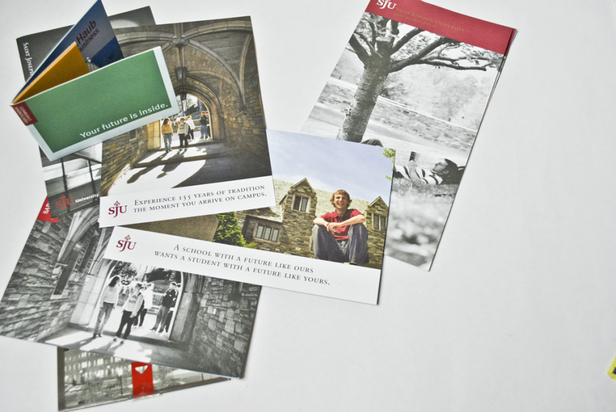
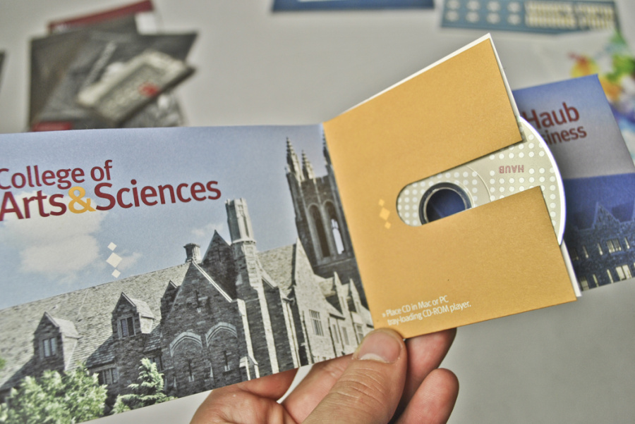
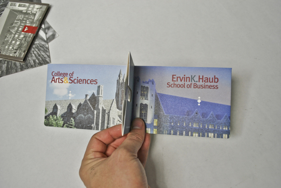
Another from The Early Years at 160 involved a promotional CD-ROM *shudder* to promote both the business and the arts school for St. Joe’s. After designing and developing said CD-ROM *shudder* *shudder* I asked if I could develop how the CD was mailed and presented. Skeptical at first, the higher ups soon realized that I did, in fact, know how to design for print. This springboarded me into the wonderful world of assistant designer for the over flowing amount of collateral needed for this years campaign. The campaign, designed by Steve Penning and written by Brendan Quinn, took an elegant and classic approach which had, oddly enough in the world of academic paraphernalia, been abandoned for years. Large black and white visuals exposing the campus life, pop red SJU header and tagline. Next to other material on the racks of guidance counselors across the Northeast, these looks positively stunning. There was no bullshit. No glitz and glam. Just straight truths. The rest of the campaign eventually rolled out many of these truths in big bold type, and accompanying imagery in due time. I commend SJU for being such a forward thinking university. Hiring an ad agency to develop a campaign that saw applications rise steadily to something like 120% increase after a year. And yes, getting national exposure during March Madness as a Cinderella team doesn’t hurt those number either. But I still say it was the work.
Launched: 2003
Client: St. Joseph University
Agency: 160over90
Designer: Giacomo Ciminello
Associate CD: Martin Duffy
Creative Director: Darryl Cilli