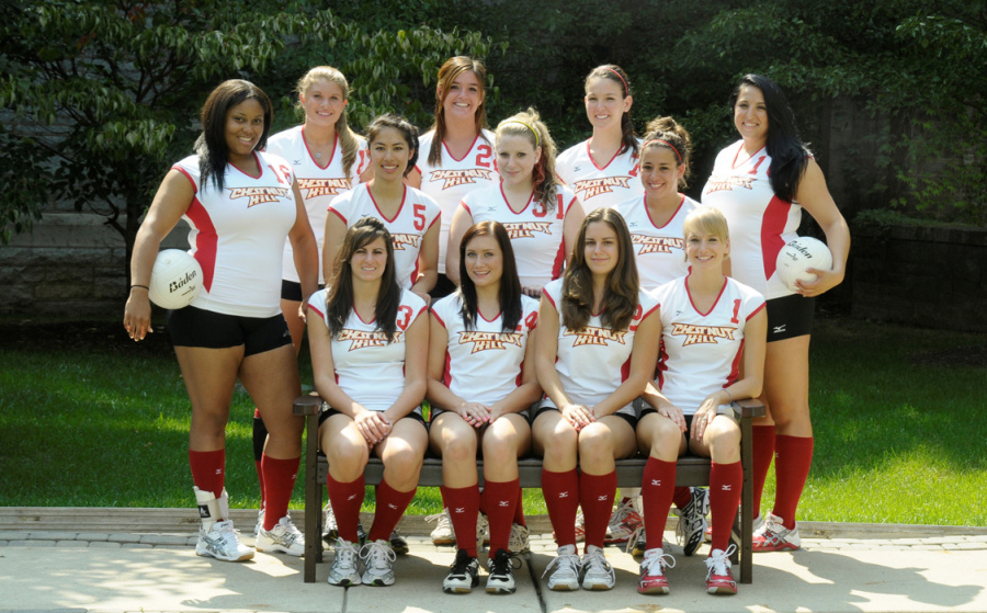
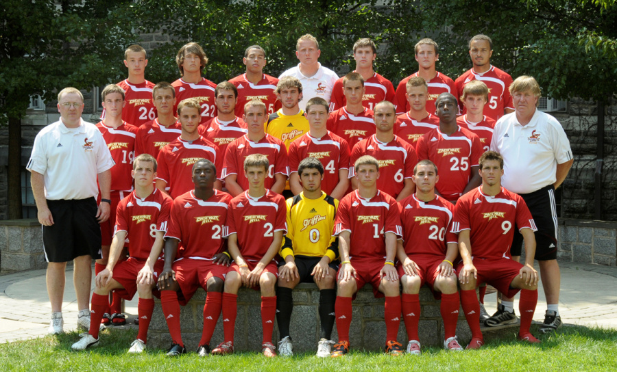
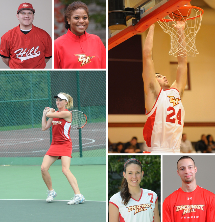
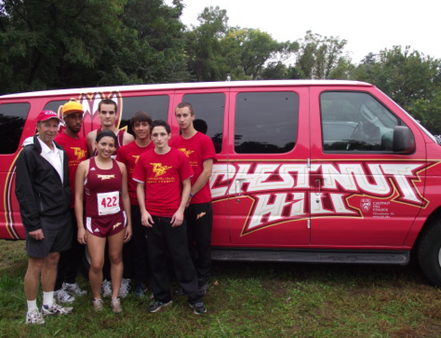
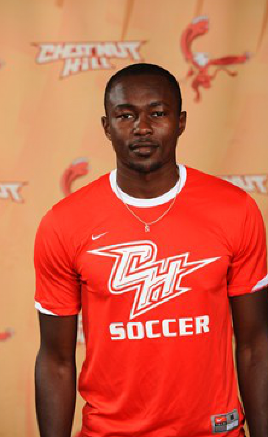
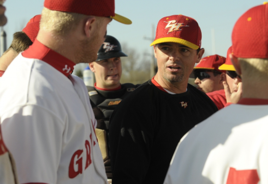
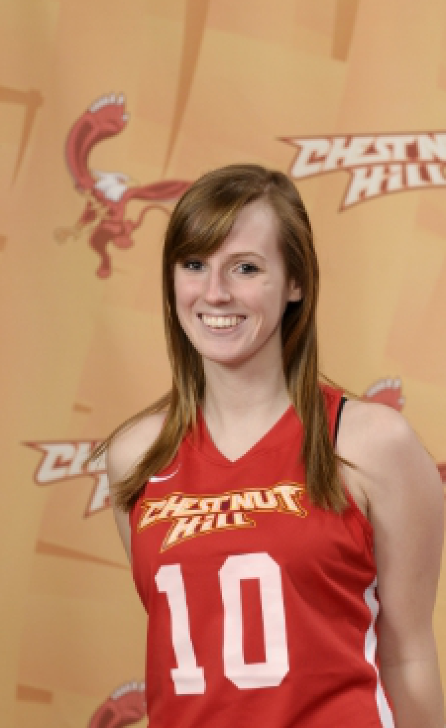
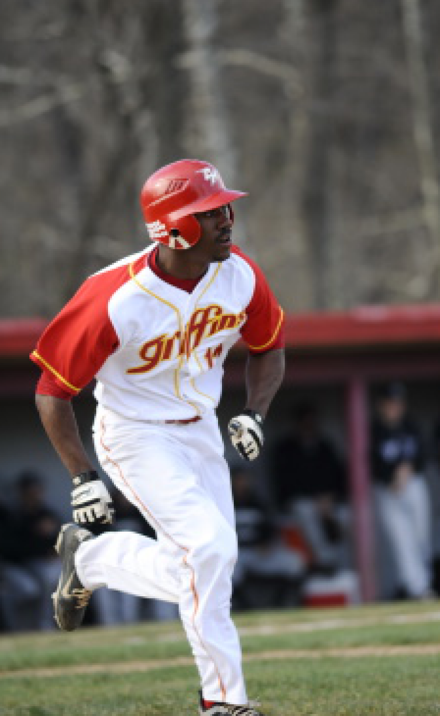
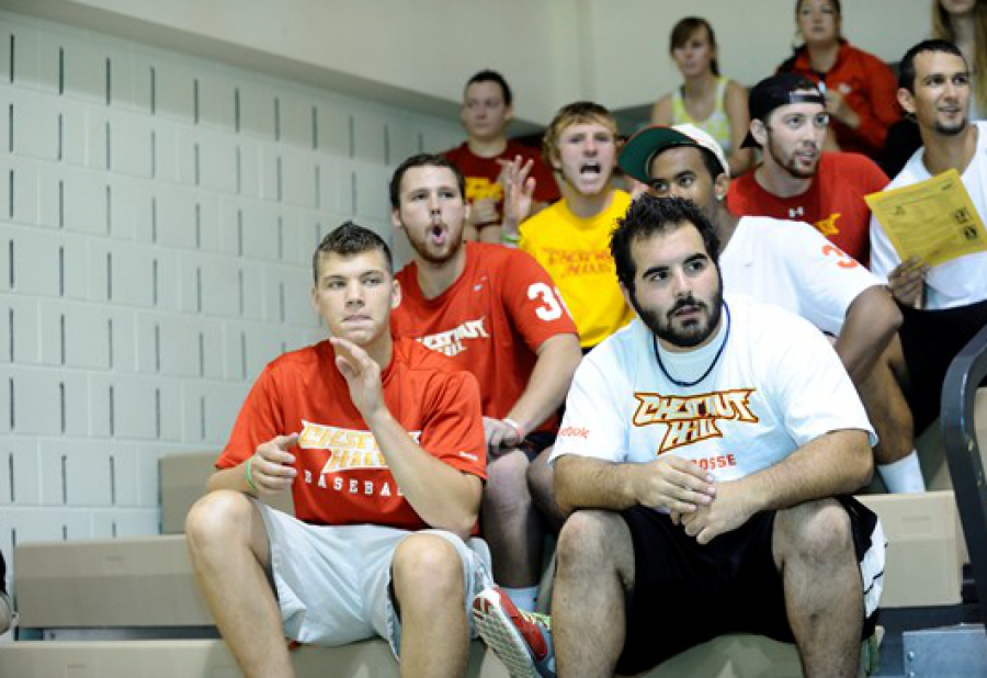
Chestnut Hill Athletics
This one’s for Sister Mary.
Sports. Perhaps it’s my vast ineptitude at playing them, or the sheer gripping power they have over people, but athletic identities are the most powerful marks on the planet. When a small Catholic all-women’s college decided to open the gates up to boys, an athletics department was soon required. Inspiration for the school was simple. With their school crest and Catholic standards at hand, the Lord himself seemed to reach through the clouds and whisper, “Listen to anything by Slayer, and get back to me when you start drawing in blood.”
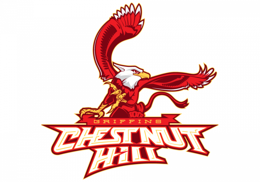
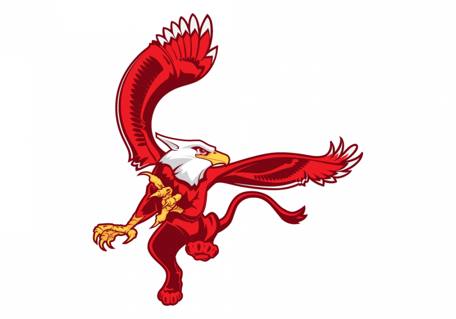
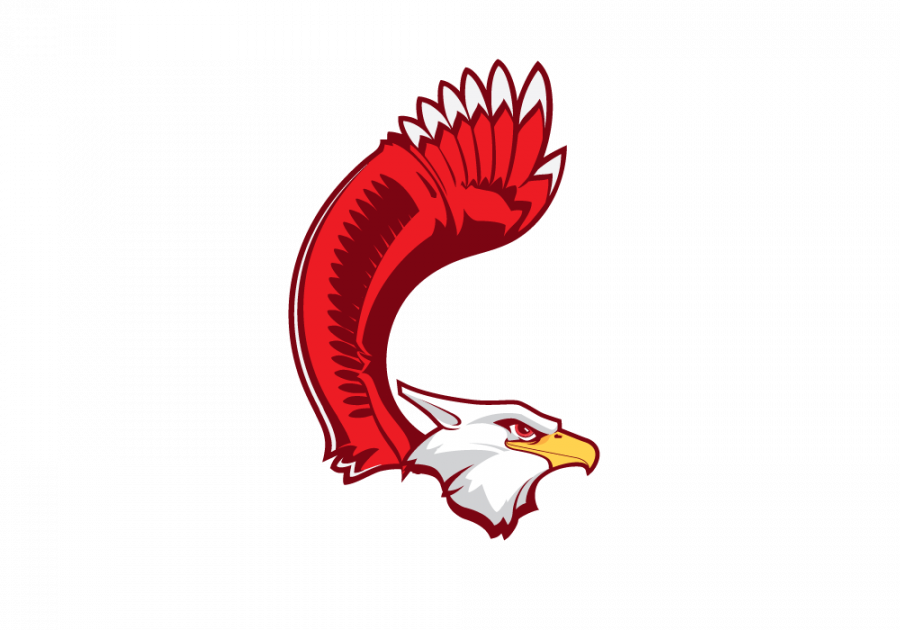
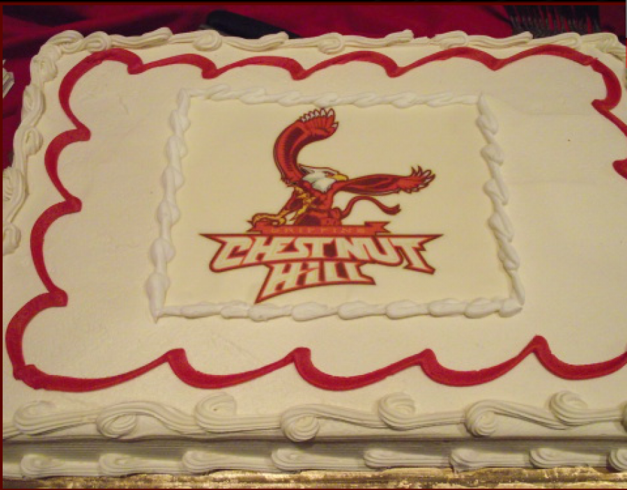
Enter, the Griffin.
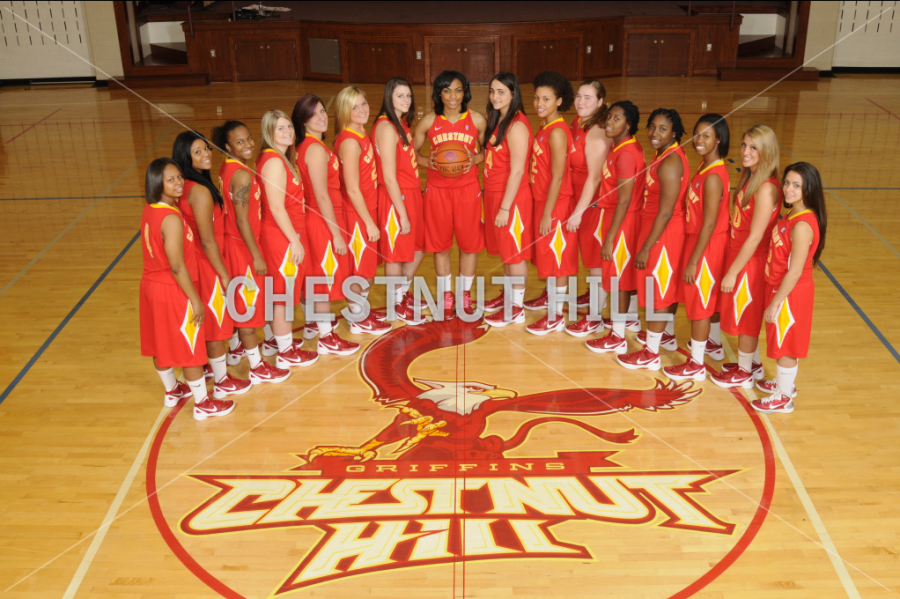
My love of collegiate identities culminated in this force to be reckoned with. The college was too small, for any of the decisions made here. An overly complex, 4-color juggernaut of a character. But Sister Mary Catherine absolutely fell in love with the direction, and dreamt of a world with a griffin emblazoned on a football helmet. This project was rushed, and in the end never truly completed due to budget, but they ran with all the marks despite each and every imperfection. While I love the Griffin itself, and the CH mark, the logotype leave vast room for improvement and was actually really just the first pass in sketch form. This identity system was not as flushed out as LaSalle’s was.
Launched: 2008
Client: Chestnut Hill College
Agency: 160over90
Designer: Giacomo
Creative Director: Jim Walls