La Salle University Explorers
Taking “pride in your work” to a whole new level.
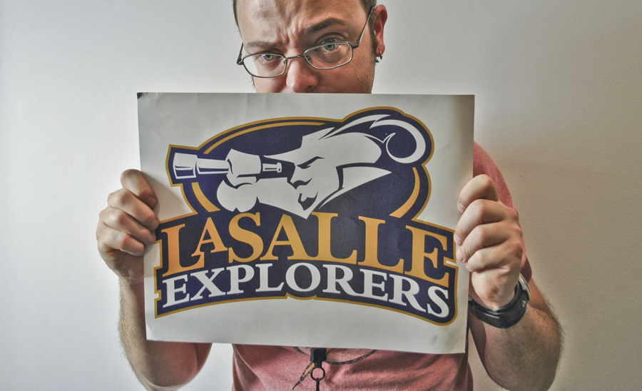
There is something really beautiful about branding. To create a moment in history for a bunch of people to latch onto. To birth an era in athletic identity. Taking pride in your work is one thing. Giving pride to an entire University is something much greater. Support my logo, buy a hat. Go Explorers!
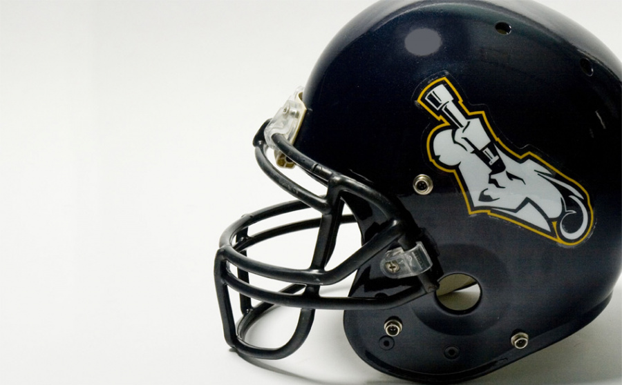
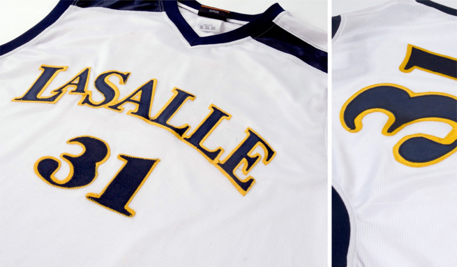
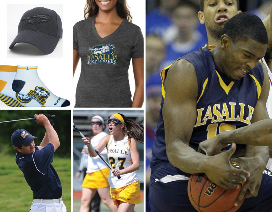
For those of you looking to venture into the world of athletics logo without any experience whatsoever, here are a few helpful tips. If it’s an athletic program for a university, remember this logo is basically going to show up everywhere, from center court to a cheerleader’s ass. Yes. I am serious. So plan accordingly. It is not just one lockup, it’s a system. This rather small school system consists of 64 unique marks for it’s various usages. Secondly, you have home, away, and an alternate. Don’t forget practice apparel either. Thirdly, try to keep it around 2 colors, 3 at most. Just trust me. Fourth, when your logo launches, to much, much fan fare, don’t be caught taking pictures of it on the cheerleader’s ass. It’s creepy. Let the intern do that.
Launched: 2002
Client: LaSalle University
Agency: 160over90
Designer: Giacomo Ciminello
Creative Director: Darryl Cilli
Associate CD: Martin Duffy