Burt Hill
Take a moment to pause, and reflect.
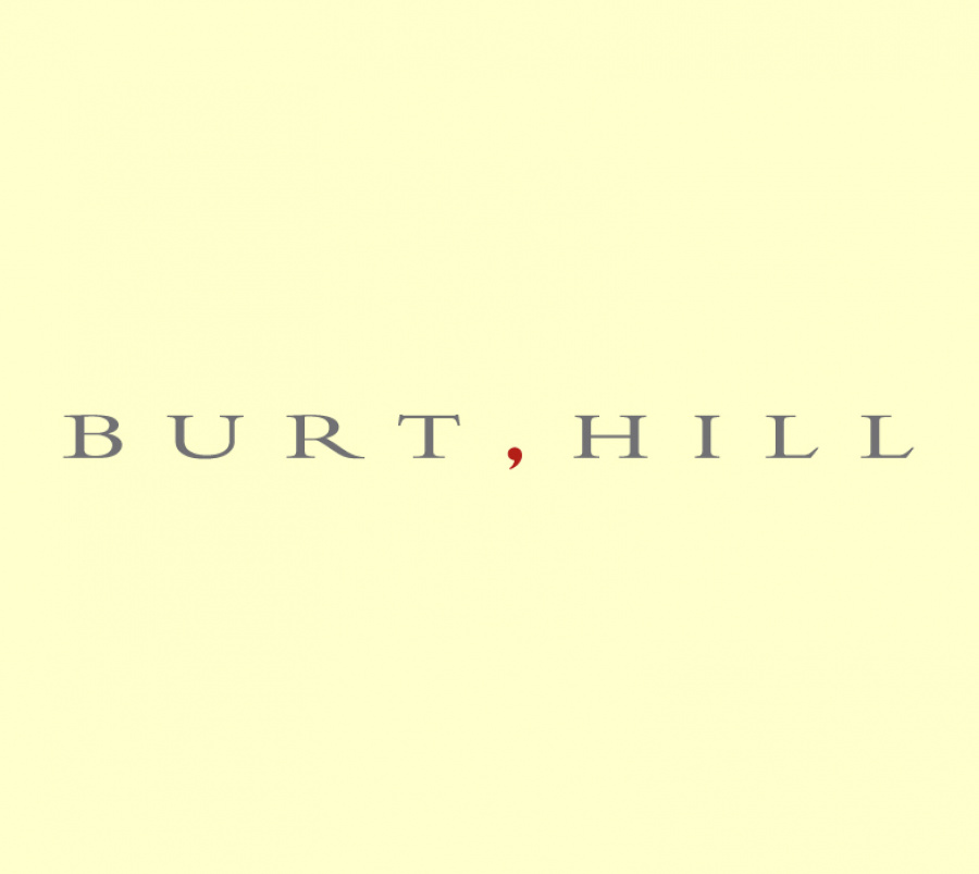
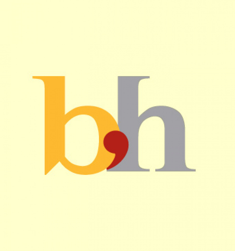
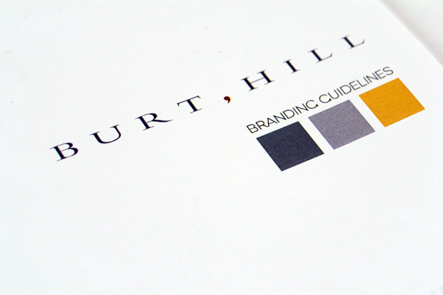
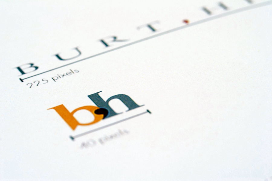
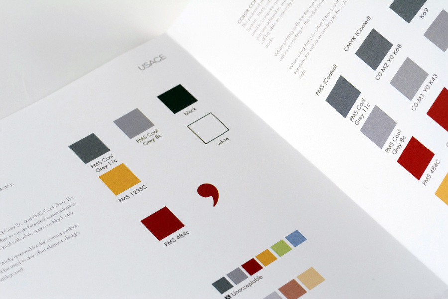
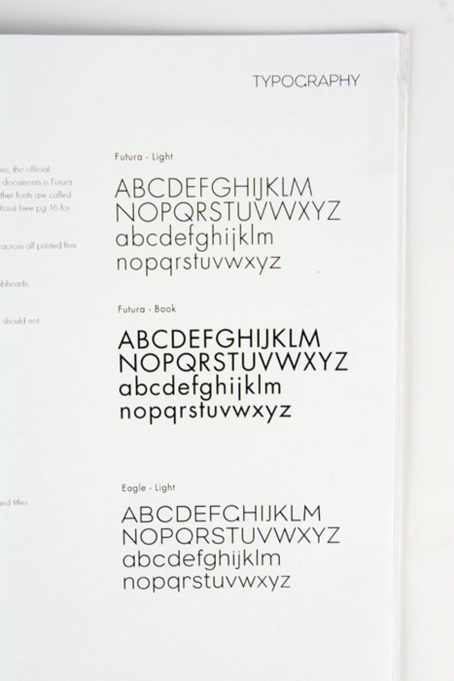
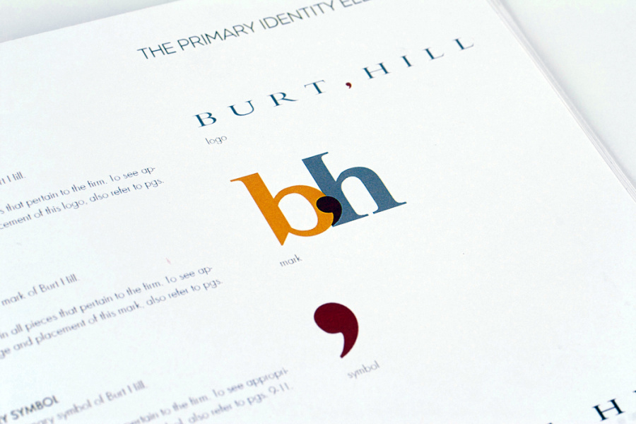
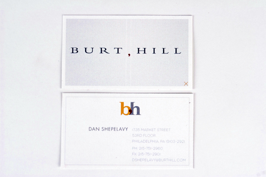
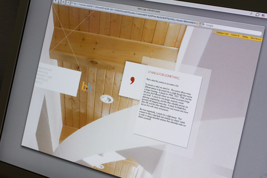
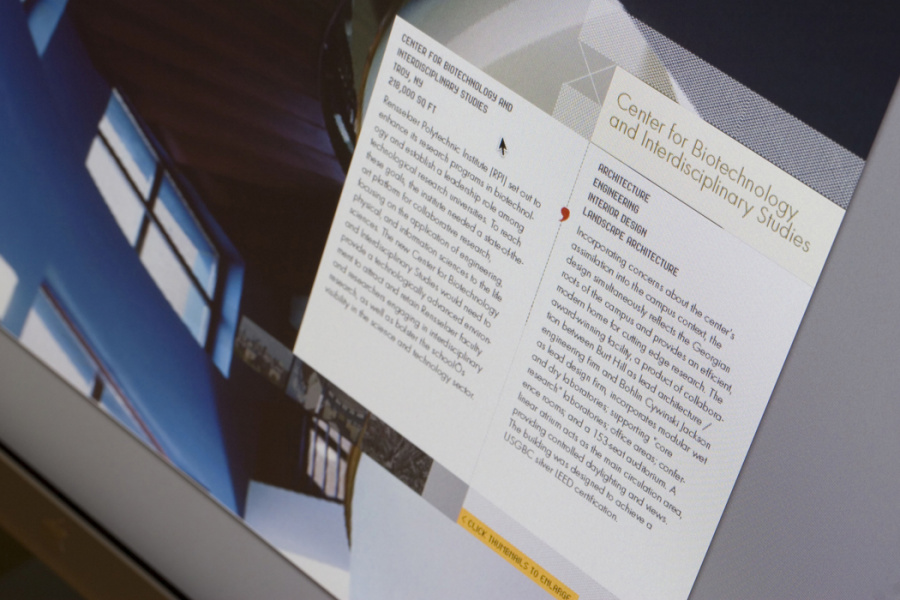
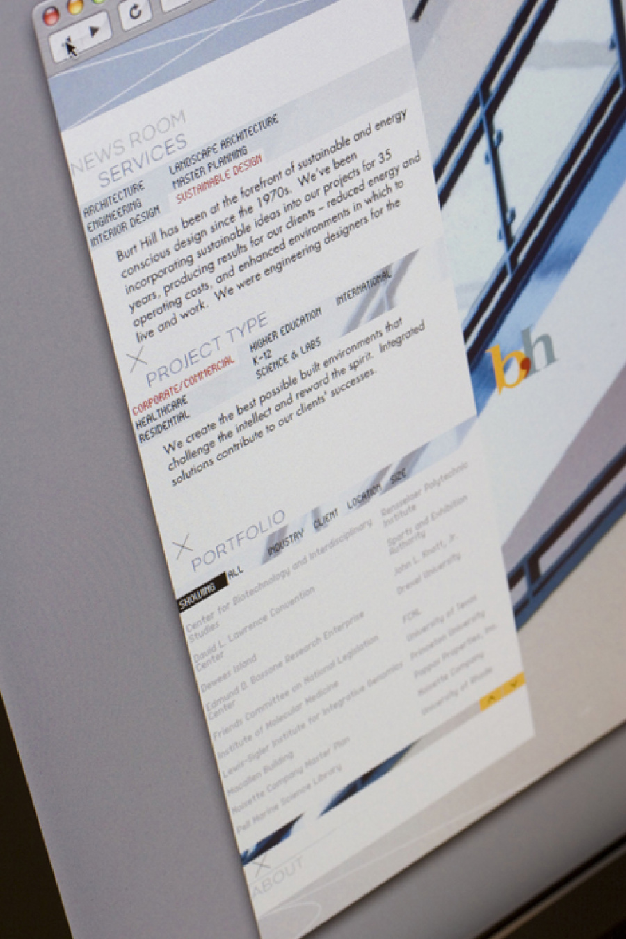
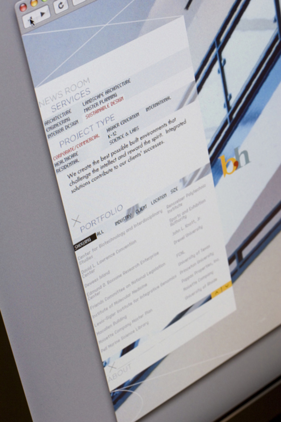
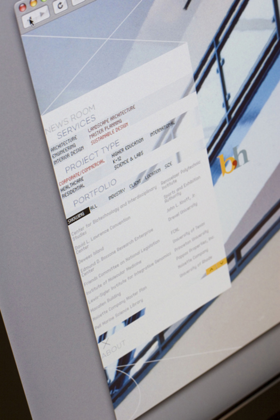
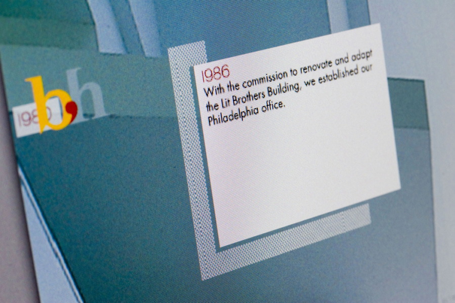
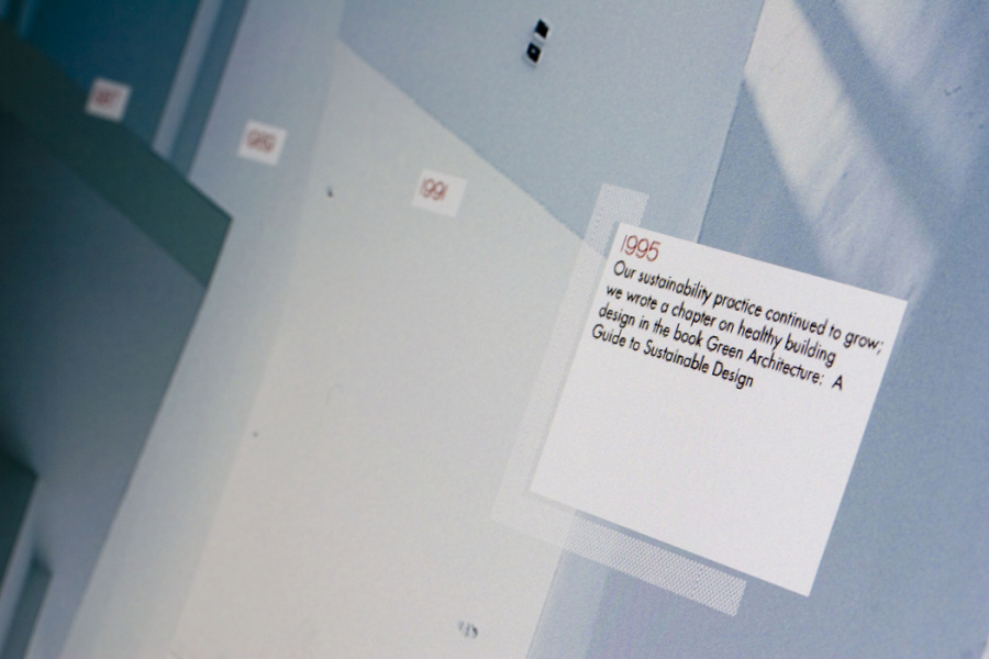
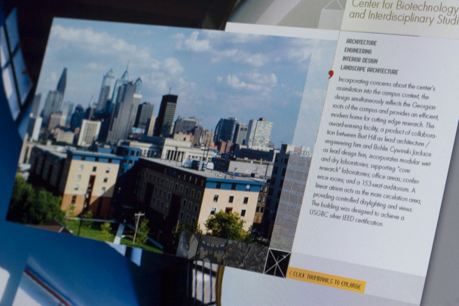
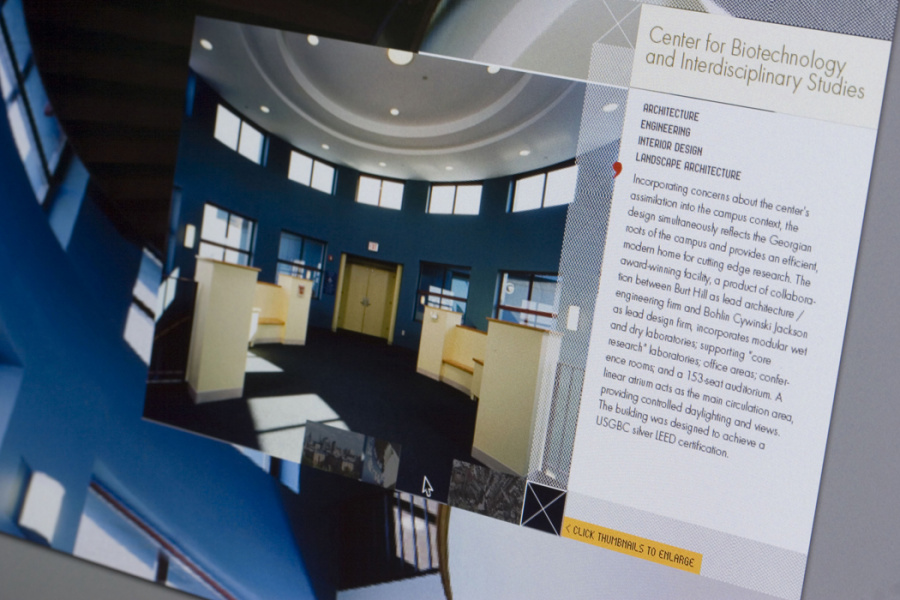
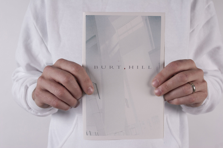
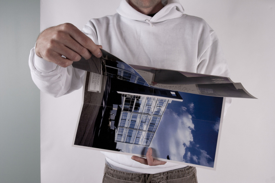
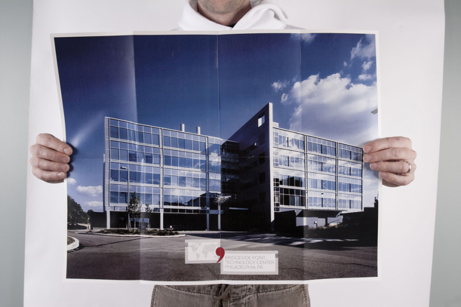
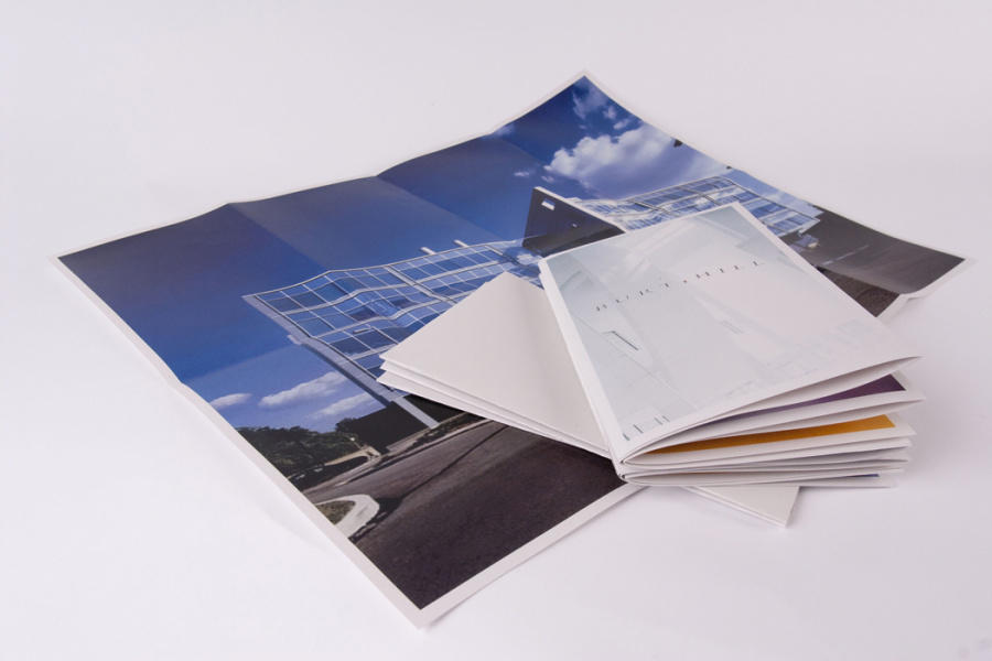
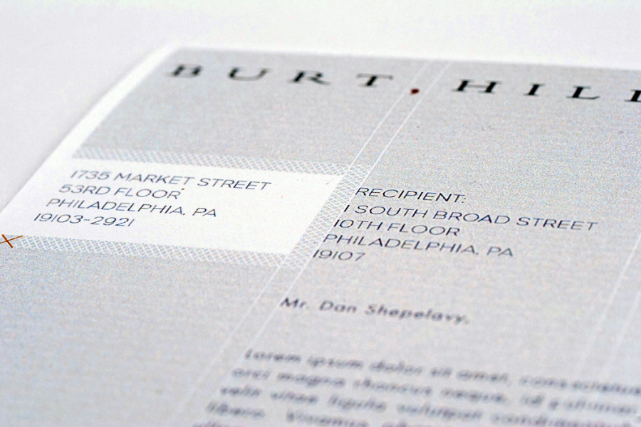
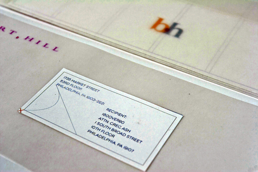
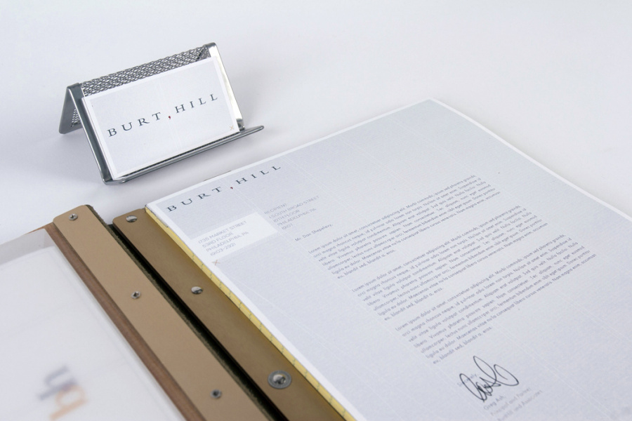
All too often architecture is looked at as a commodity. “We just need a building. Call ten firms, we’ll meet with five, and pick one. It doesn’t matter who. They all do the same thing. Just make sure they’ve built something like what we’re looking for.” And maybe some in the industry deserve it because they’ve lost their perspective. Burt, Hill, Kosar, Rittelmann Associates—a multidisciplinary firm with six offices worldwide—came to 160over90 because they wanted to be anything but a commodity. We started by convincing them to face hard facts and make dramatic changes, including renaming the firm Burt Hill. We then helped them clarify and focus their vision around a simple typographic mark—the comma—and what that mark can mean. The comma allows many single pieces to be joined to form a single thought carrying a larger meaning. It stands for 1952, 1953, 1954, and the other 61 years that Burt Hill has been in business. It stands for site design, research, master planning, engineering and the other valuable services they provide with integrity every single day. It stands for Ralph Burt, Alva Hill, Pete Moriarty, John Brock and the other talented men and women who have lead the firm with vision and passion. But most importantly it stands for a slight pause. That moment to take a step back and analyze clients’ needs in order to design beautiful solutions that ultimately make their projects successful. The brand was rolled out in a logo and mark design, Web site, brochures, branding guidelines, and a complete collateral package.
Launched: 2006
Client: Burt Hill
Agency: 160over90
Brand Designer: Giacomo Ciminello
Proof of Concept Designer: Greg Ash
Creative Director: Darryl Cilli
Associate CD: Dan Shepelavy
Copywriter: Brendan Quinn